
Visual ad design tips for supplements have never been more important. If you run paid ads for supplements — whether for fitness, wellness, or cognitive support — you’re likely already aware of how strict platforms have become with what they allow.
Meta, Google, TikTok, and other platforms all have policies that affect how supplement products can be marketed visually. If your image looks even slightly misleading or aggressive, it risks immediate disapproval — or worse, account restrictions.
This guide offers practical visual ad design tips for supplements that help you stay compliant without sacrificing engagement or performance.
 Visual Ad Design Tips for Supplements: Why Compliance Matters
Supplement brands operate in a high-scrutiny category. Why? Because claims around health, weight loss, mood, or performance fall under strict advertising policies.
That means your visuals need to follow platform rules just as much as your copy does. And since most ad reviews are automated, the smallest detail — like a transformation photo or fake button — can instantly block your campaign.
Here’s how to get your visuals approved and performing.
Visual Ad Design Tips for Supplements: What to Avoid
Let’s start with what gets flagged most often. Avoiding these elements is step one in designing compliant supplement ads:
❌ Before-and-after images
-
These imply medical or physical transformations, which are banned across platforms.
❌ Misleading or exaggerated results
-
Images showing piles of fat being “melted,” dramatic facial changes, or intense mood shifts will get flagged.
❌ Medical visuals
-
No x-rays, brain scans, DNA icons, or references to disease or treatment.
❌ Fake UI elements
-
Play buttons, popups, or fake mobile screens in the image are considered deceptive.
These are the basics — now let’s talk about what to do.
 Visual Ad Design Tips for Supplements: What Works Best
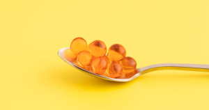
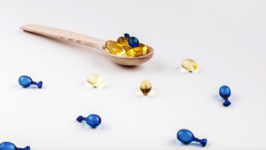
✅ Product-in-context imagery
Show your supplement in real, everyday use:
-
Sitting on a kitchen counter
-
In a gym bag
-
Held in hand by a smiling user
This makes your product feel natural and relatable without promising results visually.
✅ Lifestyle visuals
Use images that communicate the benefit of your product without directly showing the transformation:
-
Energy: someone biking outdoors
-
Focus: a person working calmly at a desk
-
Recovery: someone stretching or meditating
These visuals sell the outcome without risking ad rejections.
✅ Clean, minimal design
-
Limit on-image text (1–2 short lines only)
-
Use clear, brand-aligned colors
-
Avoid red, all caps, or urgent design elements
-
Stick to calm, trust-building tones like blue, green, or soft neutrals
 Visual Ad Design Tips for Supplements on Different Platforms
Each platform has unique preferences. Tailoring your creative style makes approval easier and improves performance.
Meta / Instagram
-
Bright, scroll-stopping images
-
Faces and natural lighting
-
Minimal overlays
-
CTA handled by the platform’s native tools
Google Display Network
-
Clean product shots on white or lifestyle backgrounds
-
No on-image text
-
Professional, brand-consistent look
TikTok
-
Raw, native-style UGC
-
People using the product naturally
-
No over-edited visuals — feel like a real video post
Visual Ad Design Tips for Supplements: Supporting Compliance
Your visuals are just one piece of the puzzle. Here’s how to ensure they stay compliant across the funnel:
✅ Match visual tone to landing page
If your ad is calm and compliant but the page is aggressive with pop-ups and medical claims, the ad may still get disapproved.
✅ Avoid results-driven language in image overlays
Words like “burn,” “shred,” “cure,” or “guaranteed” should be left out of the creative altogether.
✅ Use customer reviews or trust badges
These help build credibility visually without violating platform rules — just don’t make unrealistic promises.
Visual Ad Design Tips for Supplements: Bonus Tips for Higher CTR and Approval
-
Use UGC (User-Generated Content): Real users holding or using your product increases trust and reduces scrutiny.
-
Keep it mobile-first: Design for vertical and square formats with large, readable visuals.
-
Test multiple variants: Small changes in layout or context can mean the difference between approval and rejection.
 Conclusion: Visual Ad Design Tips for Supplements That Work in 2025
Following these visual ad design tips for supplements will help you confidently create ads that get approved and perform.
To recap:
-
Avoid red-flag visuals like transformations or exaggerated results
-
Focus on lifestyle benefits and product-in-use photos
-
Adapt visuals to platform norms
-
Match visual tone to landing page content
-
Keep designs clean, compliant, and trust-focused
Running ads in the supplement space is possible — and profitable — when you know how to design around the rules.
Check out our blogs to learn everything you need to know about advertising supplements and weight loss products — from compliance to creative strategy.